|
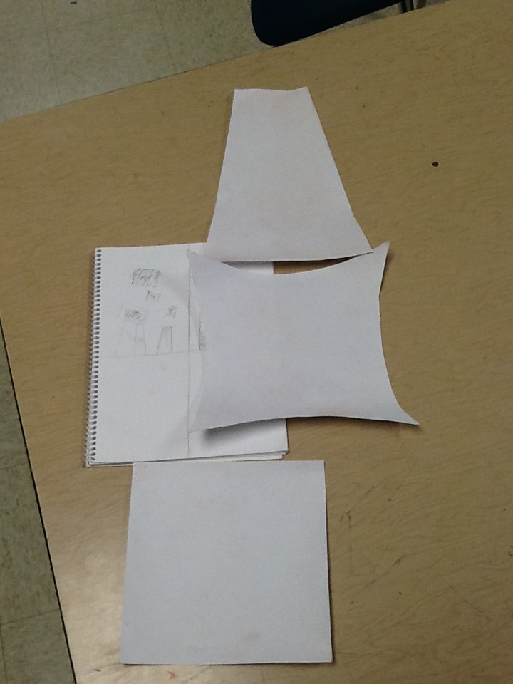
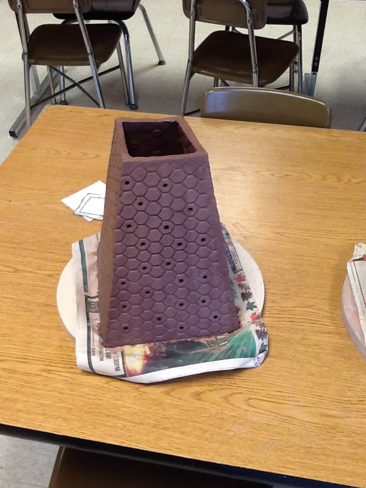
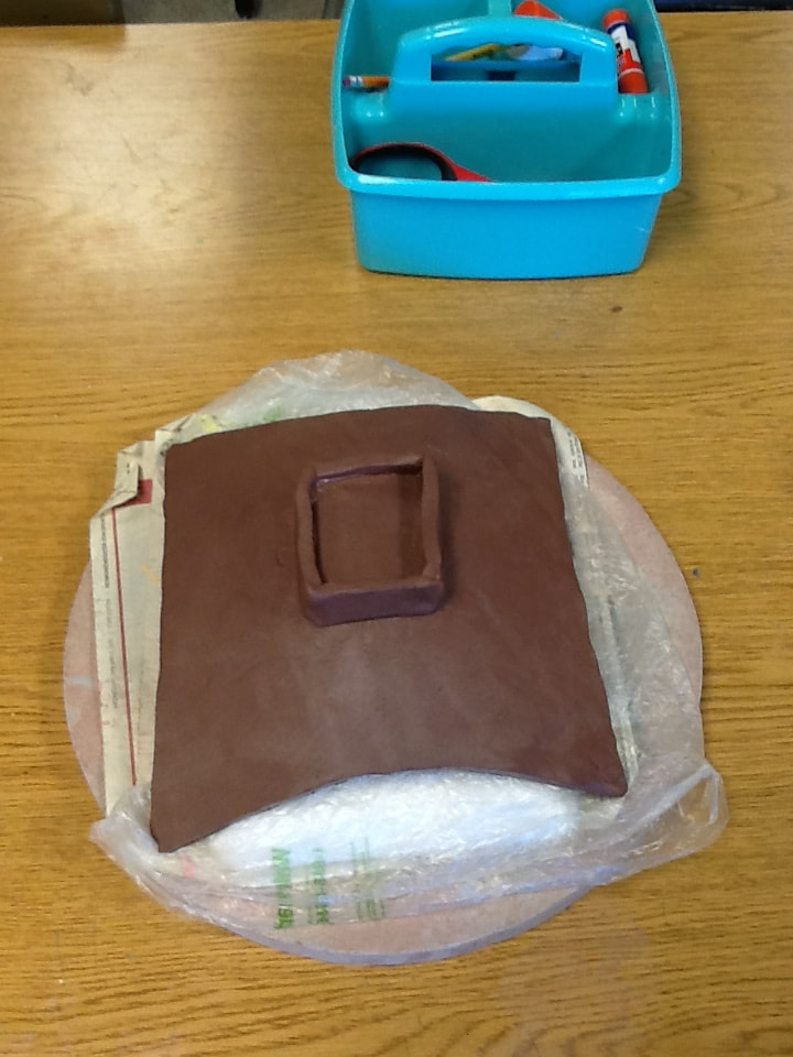
I chose to do the lantern design for my clay project, I liked they way lanterns look and they way light shines out from them. I chose this design after looking at different lanterns online. I liked the shape of it so I took some ideas from the picture and added my own texture. I had a few different ideas of my own that I used, I liked the small hole design to let light out.... I also decided to use the honey comb design because it looked cool, I was also planning on putting something inside the dish on top. In definitely gained some new skills and learned new techniques. One of the hardest parts were rolling and cutting the slabs so I think I got better at that. I also bettered myself when making the small holes in the clay. One more thing I improved on was smoothing out all of the cracks and edges to make it all flow. The most successful thing for me was the shape, I like it and it turned out pretty good. One of my main challenges was laying on the design and making it all work together. Another challenge I had was trying to roll the huge pieces of clay out on the floor. As of right now I know I want to use a dark color and one that has the different crystals inside.
0 Comments
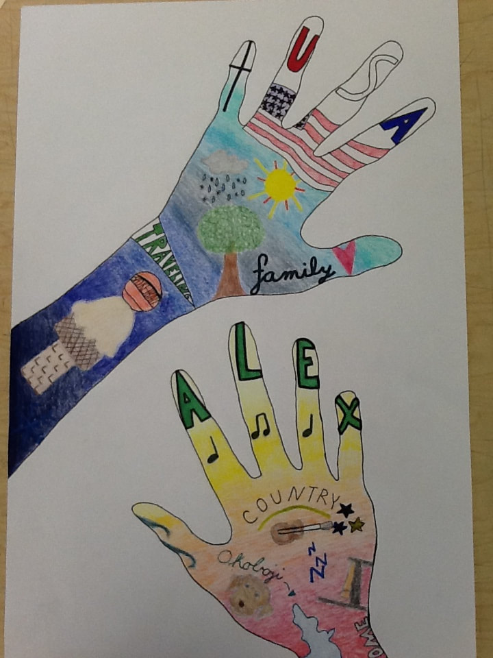 This tattoo design of my arm and hands shows different personal things about me. These are things that I like and things that make me who I am. For example, I drew different things like a cross and an American flag to show my religion and my country. I like the different symbols because they explain who I am and what I like.
There were a lot of different thoughts that went through my head while making this. One of them was doubt because I have not drawn anything in a long time so I thought my project was always bad. I was also constantly thinking of new things to draw that describe me and that was tough. There are some positives that have came out of my tattoo drawing though, I really like the right hand and the way the red, orange, and yellows blend. I think it’s a big difference from the blues and it looks good. Another thing I like is the different words throughout my tattoo and the different ways they are written are pretty cool, it makes the project look better and explains things more. Something I would do differently next time is practice more in my sketchbook because some things are hard to draw for the first time. It’s hard to get everything just right and that was a problem for me. I also would not start so dark with my blue. It looks too dark and it sticks out over the lighter colors. I am creating a tattoo design based on my arms. I will be including things that I like and also things that describe me. That is pretty much everything from ice cream to my bed... When I was coming up with these different objects and symbols I looked up different pictures online and answered some questions about myself to get more ideas. As of now, I am almost done with my rough sketch of my objects, some challenges have been trying to make it look realistic and neat. There have been some successes though, I have filled the space with things that mean something to me so it looks neat. 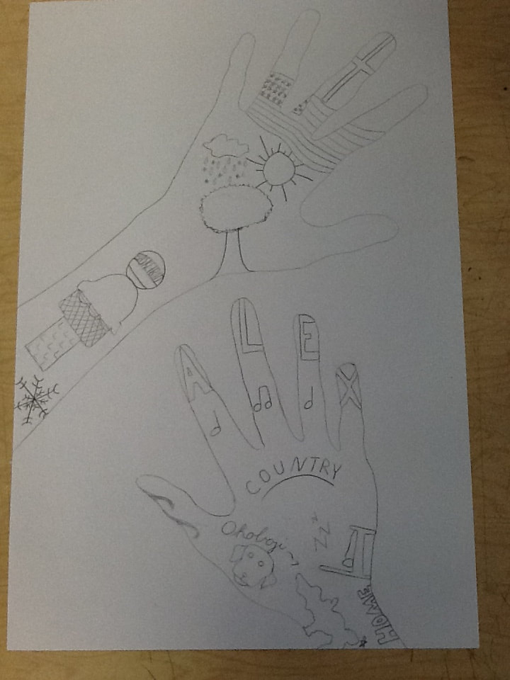 |